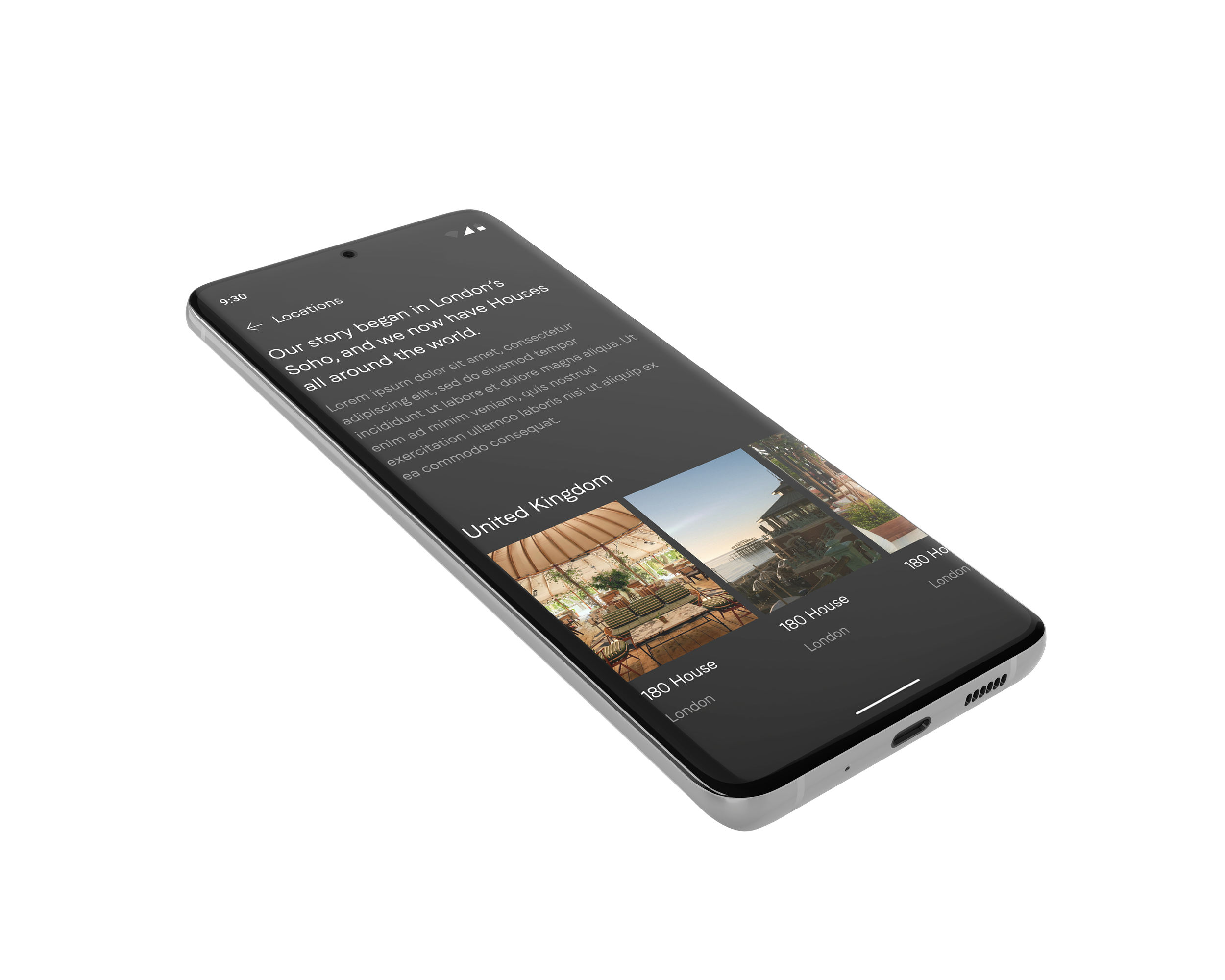
The Soho House
Harmonizing the Soho House App
Translating iOS experience to native Android in dark mode
INTRODUCTIONSoho House is a members' club for like-minded creative thinkers to meet, relax, have fun and grow. With over 30 clubs in 14 countries across Europe, North America, and Asia it offers restaurants, cinemas, workspaces, spas, and bedrooms.
Among other tasks, I was responsible for designing the dark-mode Android experience, having the iOS App as a reference. I have been crafting a design system with on-brand assets based on native Android components.
MY ROLE

Designing The Soho House App for Android (dark mode) based on the iOS App.
THE TEAM-Solo designer
-Product Manager
-5 Developers
TIMELINEAugust - December 2022

CONTEXT
The iOS Soho House App UI was much more developed than the Android App that wasn’t updated in the last two years, and some of the main foundations and components have changed since the last releases that have been happening in iOS. At the beginning of the year, the iOS team invested time & resources in bringing some of the main components of the App to custom-native, and we were going to follow the same approach to Android.
Because the Android App was lagging behind in terms of old app styling and features, I was asked to invest time in bringing the Android experience somewhere similar to what iOS had; translating the native iOS components into native Android.
Taking into account that the resources we had in the Android team were limited, we had to prioritise the work and focus on quick wins that would make a difference. That’s when we did UI Audit & Feature prioritisation.
The main and only mode that the SH Android App has used for its experience is dark-mode, so we’ll continue using this mode as the main one.
APPROACH
To better understand where the Android App was at we did the following:
1.
UI based on what iOS had live
The Android experience we were about to build needed to be based on what iOS released the latest and was live. We would not create anything new or improve any of the features already created. We needed to take the live experience of the iOS SH App as a reference.
2.
Audit of the current Android App
To understand what was the status of the Android App we analysed the styling used, functionality, and features that have been implemented. This way, we could measure what was left to be done - taking the iOS App as the reference point and comparing both by a two-column table.
3.
Agree on quick wins & feature prioritisation
After doing the Audit, we had a better idea of where the Android App was at. We needed to be efficient with our time & resources thinking about quick wins we could do to bring the App as closer as we could to iOS. This involved refreshing the UI & agree on feature prioritisation.

As part of the process of bringing the Android App closer to iOS, there were features that needed to be implemented, but in this project I’ll focus just on the UI part of translating iOS to Android native components.
DISCOVERY & RESEARCH
Before starting the process of bringing the Android App closer to iOS, I had to understand what were the differences between both platforms, and what would it mean to translate the designs from one system to another.
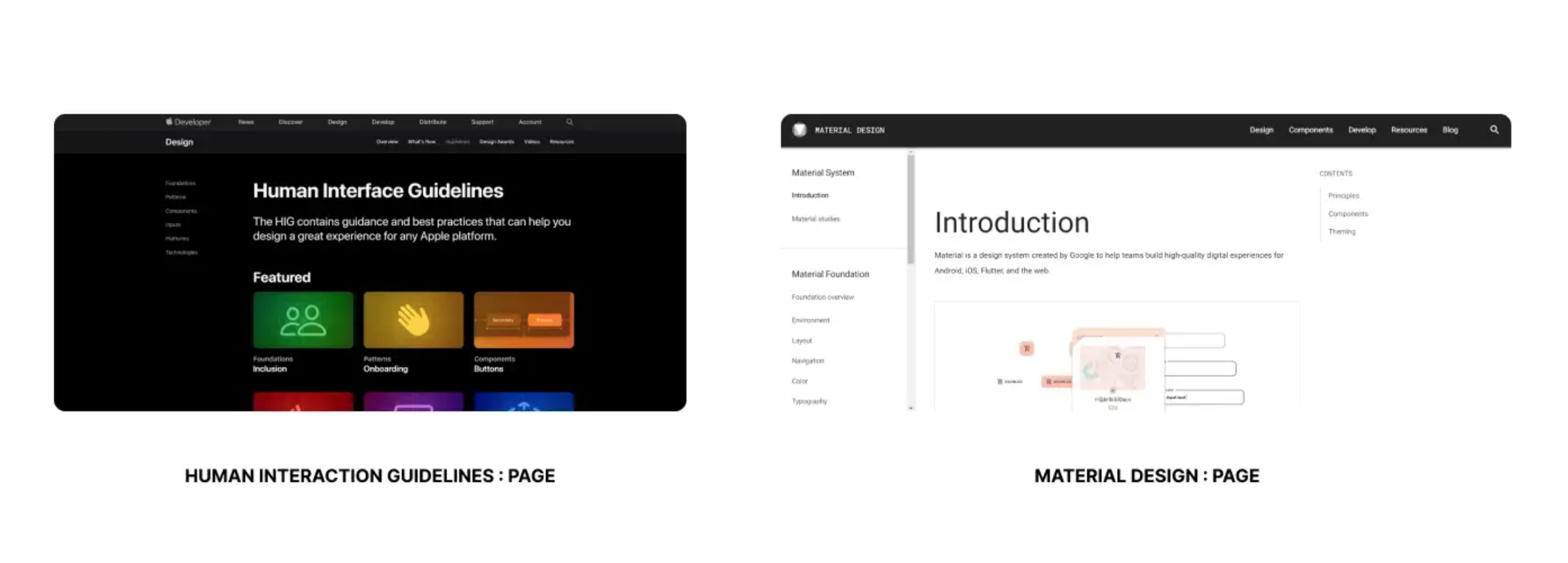
So I went ahead and started learning about the two design systems: The iOS design system is based on HIG (Human interface guidelines) & the Android system is established in Material design system.
The first thing I did was to google Mobbin to study iOS and Android versions of some popular applications (Eg: Instagram, Twitter, Spotify), and understand the main differences between them. I could clearly see many disparities but not as much as I thought, as recently with Material 3, you can see that both systems are becoming closer to each other.
Doing the research and comparison between both systems, I’ve found many differences that needed to be reflected. We had to make a decision on which components we were going to implement in our app as native, and which ones we were going to skip for now and leave based on iOS components.

DECISIONS
At the Soho House, there’s a strong aesthetic principle that is very distinctive and unique. If we had to change all the components to translate them to be native for iOS and for Android, they will make the digital experience look different across platforms - so we prioritised our components being on-brand among being native. That means that if a component had to radically change to be native, we would leave it custom for the time being.
There were still some aspects that needed to be reflected to make the experience more intuitive on each platform, so the iOS team made some decisions on which components were going to be kept and which ones were going to be translated into native. The same process was applied to Android. We wanted both apps to look as similar as possible even if they were displayed in different software.
In the following section, I reflect on the main aspects that we decided to bring native for both iOS and Android and the differences between them:
Screen resolution
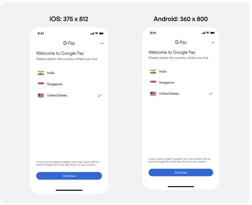
As we want to design for a wider audience with no specific device in mind, the default screen resolution that we went for in iOS was the iPhone Mini 13 (375 x 812px), and for Android the Samsung S20 (360 x 800px).
Navigation
By default, iOS doesn’t really have a control that looks like regular tabs. They have “Segmented pickers” that can hold up to 4 options, and that allow you to navigate between different views on a single page. However, Android refers to regular “Tabs” when introducing this functionality even though they have Segmented pickers too.
Layout grid
While researching the layout grids, I came to a conclusion: In HIG, there is no use of grids and the side margin is 16px from each side. In Material Design, the grid has four columns with 16px of gutter and 16px of margin from each side.
Dialogs
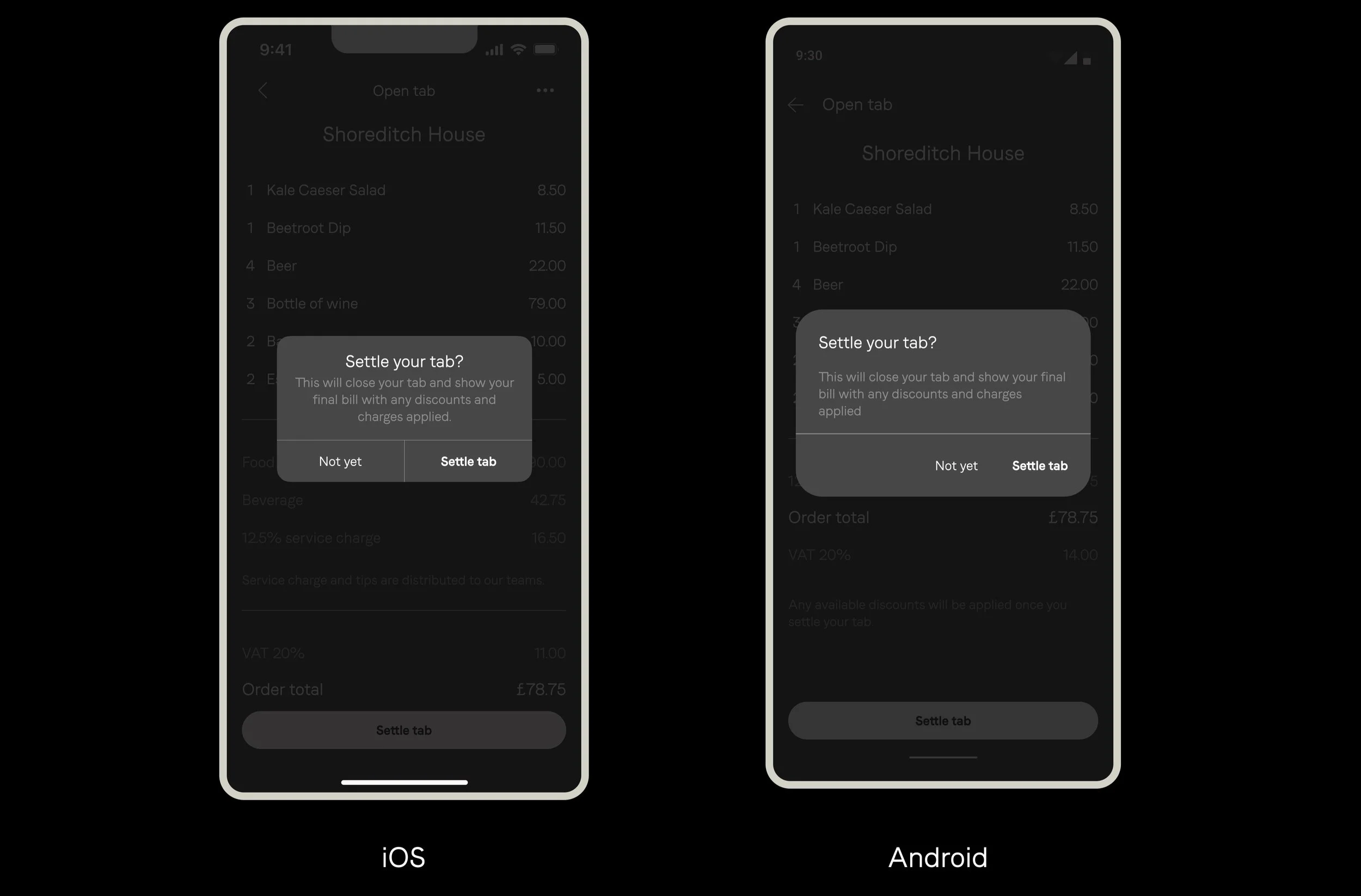
An alert dialog on Android confirms the user action and informs the user of what will happen as a result. The main CTA is colored and bold.
On iOS the negative action is colored in red and the cancel action is usually bold and blue.
Search inputs
On Android you can cancel search mode by clicking on the back button, and clear the query by clicking “X”.
On iOS you can cancel search by clicking on the “Cancel” button and clear the query by clicking on the “X”.
Selection controls
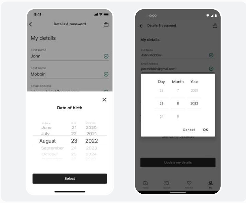
In iOS, the picker control allows you to scroll through a number of values to select. They are usually anchored to the bottom for easier thumb access. On Android, however, picker controls appear in a dialog box, and the values can be typed in and scrolled.
On-brand native Android components have been included in the Design system, such as the status bar, toggles, selectors, sheets, and native keyboard among others that are slowly being incorporated into the Design System.

IMPLEMENTATION
Experimenting the differences.
In the following section some examples of the Soho House App screens are displayed to compare their appearance:
NAVIGATION
There were still some functionalities that needed to be added on Android to bring it to the same level that iOS had; that’s why some of the tabs displayed on Android don’t correspond to what we can see on the iOS screen. We had to schedule a phased plan of releases that will allow the Android experience to become closer to what iOS had live, and that sometimes meant varying the elements on the interface.
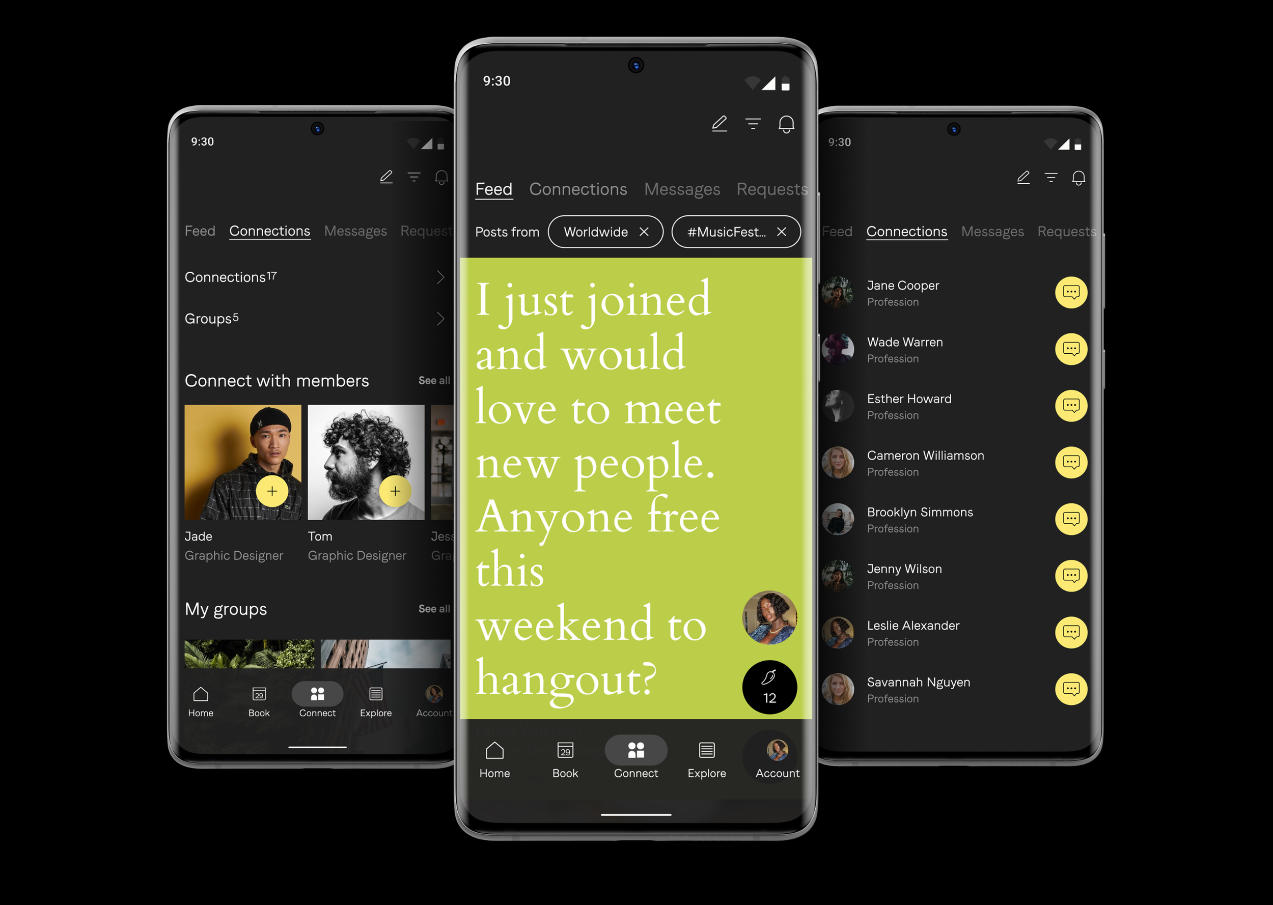
Taking “Connect” section as an example: for the navigation we needed to make some decisions about the priority of the buttons that we were going to show up in the top Nav, as Android just allows you to place 3 icons (there’s also the option of the bar atop - three dots- but we wanted to avoid hiding options for now). As main functionalities, we decided to place “Create post", “Filter” and “Notifications” as the top ones, and include the rest that iOS displays as icons, in the Android Tab menu.
SEARCH INPUT
On Android, the search bar is longer, it also incorporates the “X” button that deletes typed-in content, and instead of “Cancel”, the back arrow brings the user to the previous screen.
On both systems, when the user clicks on a search bar/icon, it will automatically display the search bar on a separate page, not to distract the users to take another action. On iOS, the search bar is usually located in the top navigation bar or as one of the main destinations in the tab bottom bar. On Android, you’ll most likely find the search icon in the top navigation bar.
The search bar functionality and building blocks are the same for iOS and Android. What’s different is how the search bar is designed.
On iOS when you start typing, you’ll notice an “X” icon. That’s how you can remove the typed-in keyword string, the same happens for Android. The iOS system also incorporates the button “Cancel” which would stop the search flow and return to the previous screen.
DIALOGS BOXES
On the image at the top, native dialogs are displayed for both iOS and Android, that have been customised with Soho House styling, matching colours and typography.
SUMMARY
This project has been combining components that work as 100% native, native components that have been customised, components we are keeping for both platforms (Android components based on the iOS experience), and the ones we are keeping from the previous Android experience (the one released two years ago).
The tricky part of this project has been deciding what we would keep and what we would create as part of the new experience. If we have had enough resources, we could have just started from scratch and built a new Android native system, based on the iOS experience, but we have had to prioritise the work by phases, taking into account what has already there, and the parts that needed to be included without differing too much, and trying to not create two different experiences within the same app (the old and the new). That’s why auditing, prioritising, and planning have been a crucial part of this project.
HOME & BOOKINGS
HOUSE PAY
CONNECT
WHAT UNLOCKSA cohesive App experience across platforms for both iOS and Android that feels connected and cohesive.
The opportunity for the users to enjoy the features that so far were only offered for iOS clients, being now fully available for everyone that uses the Soho House App - no matter what device they use.
Expansion of the Soho House brand experience, conquering new digital platforms.
