Ikawa Home
Roast with Confidence
A redesign journey from frustration to empowerment for an intuitive Coffee-Roasting App for Home Enthusiasts
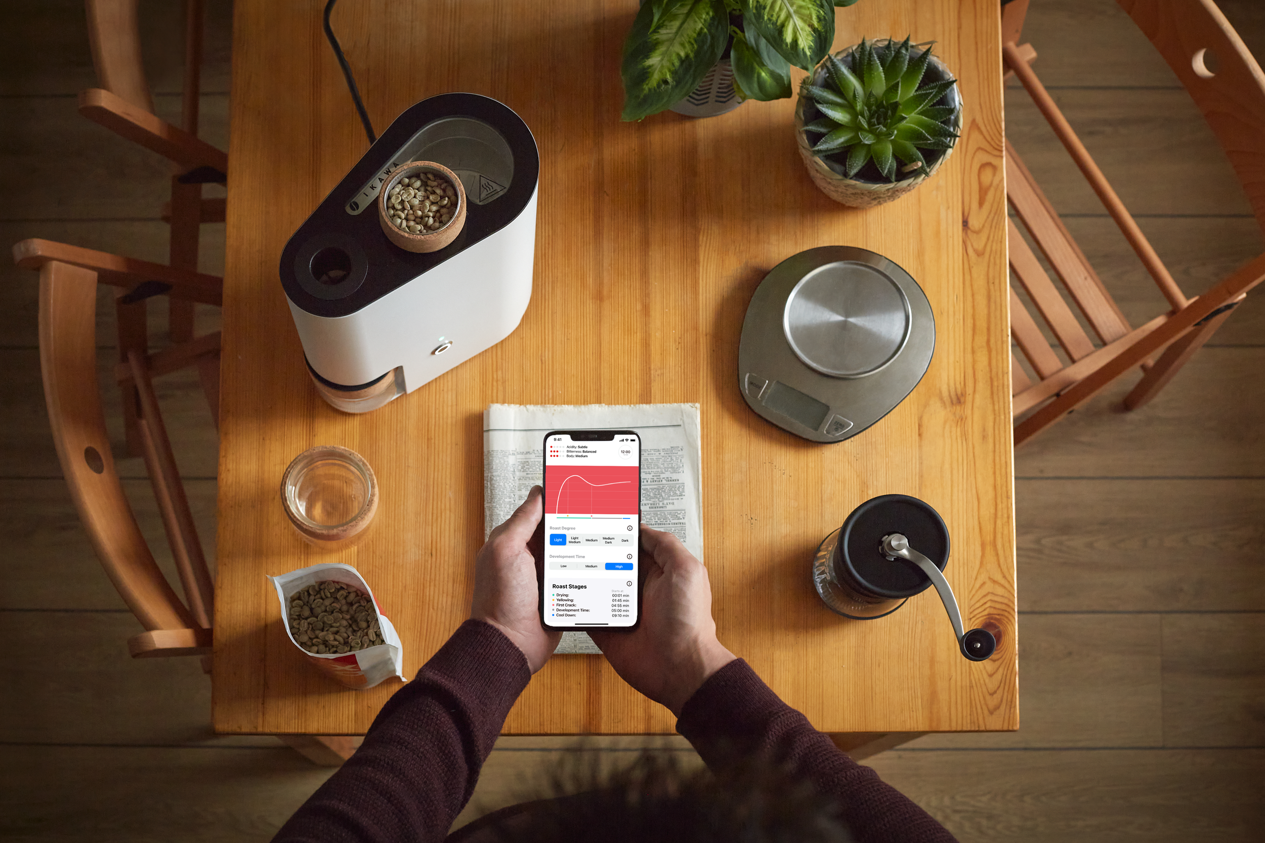
INTRODUCTIONIkawa is a company that designs and manufactures digitally controlled coffee roasters that are used by professionals and consumers. The roasters are built with connectivity in mind and are run by an app.
Roasting coffee at home can be incredibly enjoyable, offering consumers the freshest flavour potential - unlocked and changed through the many ways it can be roasted. Green coffee introduces users to the fascinating world of one of the most complex elements, uncovering hundreds of properties and a huge range of possibilities that coffee has.
Ikawa’s Home mission is to make home roasting commonplace, allowing coffee drinkers to be able to roast their own coffee at home and easily adjust the roasting to suit flavour preferences.
In addition, Ikawa supplies high-quality green coffee directly to consumers as part of the ‘at-home’ roasting ecosystem. Being in direct contact with farmers, Ikawa shows first-hand how coffee is produced and the characteristics of the place where it has grown.
MY ROLEResearch, analysis, product design, design systems, user-testing.
THE TEAM2 Designers
1 User researcher
1 Product manager
2 Developers
TIMELINEApril - December 2021 - (8 months)
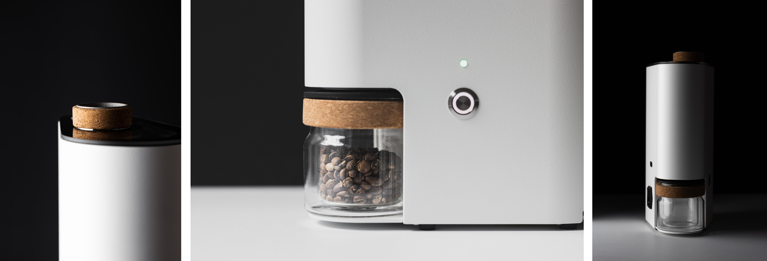
BACKGROUNDThere was an existing app created as an MVP for Ikawa Home (both for iOS and Android) that didn’t meet the expectations of our users because they didn’t understand how it worked. It created a lot of frustration, resulting in our users not utilizing the roaster after a few times because they didn’t get the roasting results that they wanted.
Furthermore, the Ikawa Home App was based on the Ikawa Pro app (for professionals). This meaning, that the majority of the functionality and features that were in Ikawa’s Home App were based on a professional level of knowledge that our users didn’t have. We needed to take this into consideration and probably pivot from our current [Pro-roaster-inspired] user experience to a more adequate level of knowledge/experience of our users.
THE BRIEFWe needed to redesign the current app, taking into consideration the frustration that our users were getting when they were not being able to understand what was happening and didn’t have control over the outcome. We needed to pivot from our current [Pro-roaster-inspired] user experience to a more adequate level of knowledge/experience of our users and provide them with information, making the experience of roasting at home easy and enjoyable.
So far the app was recipe-focused, and we needed to change the perspective to be a coffee-driven journey, in which we make the user excited about coffee and its origin characteristics.
We also needed to change the look and feel of it making it cohesive with Ikawa’s brand and taking into consideration that it was only going to be developed for iOS.
THE APPROACHHaving a number of stakeholders with strong opinions on the direction of the project, I decided to ask everyone to clear their schedule for a week and take part in a Design Sprint to agree on a defined approach for designing the new app.
For a better understanding of our user’s coffee knowledge level, expectations, and pain points when using the MVP, we did 3 rounds of Sprints in which we tested 3 different assumptions. These assumptions were selected from the collected feedback we have been receiving in the last 2 years, since the MVP was launched, in addition to the user interviews we did just before the start of the project (mainly Pioneers - our main persona).
PROBLEM STATEMENTCoffee roasting is a complex process that takes a long time to learn and understand. Our users feel lost because there’s no central and reliable source of information for learning so they end up feeling discouraged and giving up.
Ikawa users need an enjoyable way to confidently get the coffee roasting results they like by relying on Ikawa as the experts to guide them through the process.
How might we help the user to learn more about the process of coffee roasting, so they understand the cause/effect of what they are doing when interacting with our product? This way they‘ll be more engaged with our device by increasing its usage, and avoiding the early frustration that they get for not being able to understand how the changes they do affect the roasting results.
BREAKDOWN OF THE PROBLEM🤓 Professional-oriented app
The app was inspired by the Ikawa Pro app, in which the knowledge and experience level is not suitable for the Home users.
⛓ Disjointed experiences
Information is siloed and doesn’t work together to give meaning & insight. The lack of information on the platform caused confusion and annoyance in our users.
🤔 Abscence of guidance
Our users need to understand the process and cause/effect of what they are doing.
🖥 MVP user interface
The app didn’t match the Ikawa brand and it created a disorienting experience. It was created as a prototype and didn’t look like a finished product.
SUMMARY OVERVIEW OF THE OLD EXPERIENCEThe current app has the basic functionality for a user to be able to roast green coffee in the roaster; but it hasn’t taken into account the user's knowledge, expectations or overall experience.
THE USER PERSONASIkawa Home is used by different personas across different levels of coffee roasting knowledge and experience. The main persona that we were targeting for designing the new app was the Pioneer.
Our users include Pioneers, Hobbyists and Seekers. All different archetypes with different needs and characteristics who interact with our product. However, previously we did some work on market size and found that Pioneers had the biggest scope for growth for our product.
HOBBIESTAdam is 53 years old and has a dedicated space for his coffee roasting and preparation, where he spends a lot of time analysing the data points of his roasts. His aim is to learn as much as possible and become as close to an expert as he can. His friends and family would describe him as a coffee bore,
SEEKERCharlie has recently retired and was looking for a new hobby to grow into. He wants to take control of his coffee journey and recreate those special moments from travelling. He likes to share coffee with friends.
THE PIONEERThe Pioneer is a 35-45 Male, who has a high coffee affinity, have a young family, and live outside of the city. He is very time poor so needs hobbies to fit around his busy life. He is a keen cyclist and climber, and loves spending time outdoors with his family. He looks to brands such as Tesla, Leica, Fender, Apple, Patagonia, Hay and those that support his need for community, transparency, design aesthetic. He is starting to look at new ways of consuming. Pride and status is a big driver for them.
THE PROCESSWe kicked off the process with a comprehensive experience review of the current practice to understand pain points and what our users expect to encounter.
On the other hand, for a better understanding of our user’s coffee knowledge, expectations, and pain points when using the old app, we did three rounds of Sprints in which we tested three different assumptions. These assumptions were made from the collected feedback that was received in the last 2 years (since the app was launched), in addition to the user interviews we did just before the start of the project ( mainly Pioneers - our main persona).
KEY TAKEAWAYSSeveral workflows and experiences in the existing product scored very low as per our benchmarking.
Very high drop-off rates (specially after a few roasts) indicated poor engagement and overwhelming product complexity that we needed to address.
We took a strategic decision to intentionally position Ikawa Home for coffee roasting newbies and people with low-medium knowledge to amplify growth.
We planned for an end-to-end visual and usability refresh to address dated UI paradigms and make Ikawa modern and delightful.
A more detailed explanation of what we tested in the Sprints below:
-
In Sprint 1, we first decided to test the opposite extreme of the main feature of the App 2.0 we had, in which users were not able to freestyle-edit the graph (avoiding frustration) and were presented with a list of pre-made recipes already tested by our experts and ready to be roasted just by clicking on them and sending them to the roaster.
After testing this option, we realised that our users wanted to be in control of their results and this feature was not giving them the ability to create and explore their own recipes. Even though they didn´t understand what they were doing in the freestyle graph, they liked having the option of being able to edit it by their own preferences. Excluding this feature would get rid of the fun and sense of control that our users crave to have.
-
In Sprint 2 we tested a prototype that included a limited control of editing the recipes (by parameters in sliders with already pre-made recipes) + the option of the Freestyle graph as an added feature (if after selecting the recommended recipe the user still wanted to edit).
After testing this prototype, users were happy for the option of choosing an already-tested recipe by Ikawa, which guaranteed the results they were getting from roasting, but also content for having the option of freely editing the graph, as they were able before. This way, they could keep experimenting their own way, but also had the option of choosing a “tested by experts/recommended” recipe to use as a reference to keep learning and educating themselves.
The parameters that we used in this prototype for selecting “already made” recipes were: Brightness, body and sweetness. Users were not clear about what “brightness” and “body” meant. When asking for definitions, we realised that they would change for every user, so we noticed that these weren’t the right parameters to include as choosing options, as they were abstract.
-
In Sprint 3 we tested a two-tier app structure in which “Guided edit” was the main app feature for choosing a recipe, and if wanting to freestyle the graph, the user needed to upgrade to a “Premium” plan. Our hypothesis was that users needed to know that they could still edit the graph however they wanted, but they weren’t going to use it because the “Guided edit” mode offered them all they needed.
This option was also a good way to differentiate the Ikawa Home business from Ikawa Pro, in which users are learning how to be coffee professionals, whereas Pro users already are, so will have the skillset to be able to fully edit the graph. We were clearly dividing our audiences and setting a clear differentiation in the app features that we were offering, avoiding being Pro-based as the Home 2.0 app was.
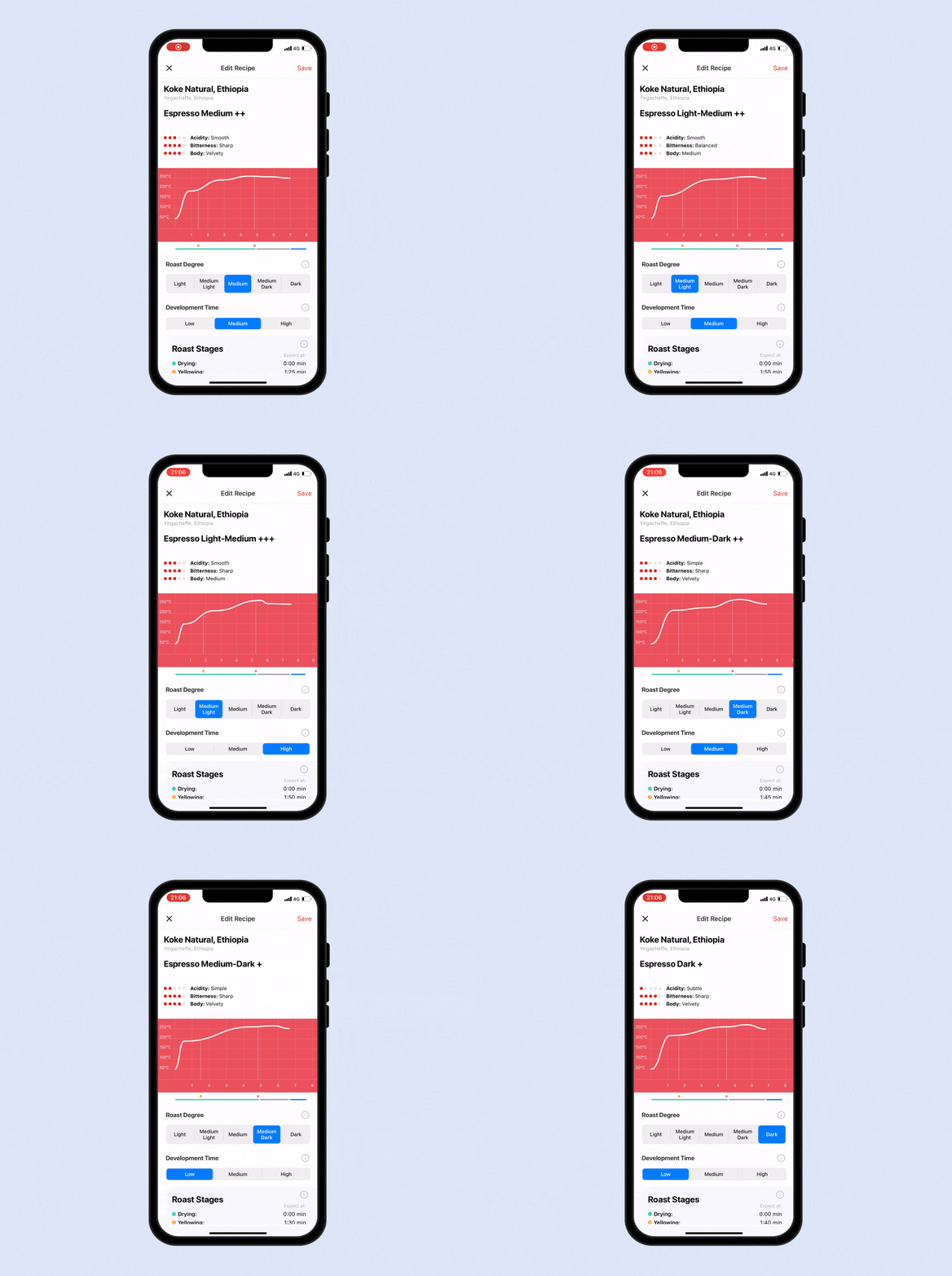
In this prototype, we also replaced the flavour indicator sliders with Roast degree and Development time parameters that are visual and concrete, helping this way to better understand the outcome the user will get. Each slider will have a determined number of points that when sliding them, will change the look of the graph.
After testing this prototype users felt that the “Guided edit” mode provided them with a greater understanding of the cause and effect of a roast recipe. Users also realised how the changes impacted their results and felt more confident they will get the results they want, whilst enjoying the process.
The Freestyle mode facilitates experimentation and full control of a roast building on the foundation of knowledge from the “Guided edit” mode.
Users would be happy to pay for this additional functionality if there was additional exclusive content and support from Ikawa as the experts.
Design goals
The experience review also helped us define our focus areas for the redesign.
FLEXIBLEThe new system has to allow us implement content in a repeatable and scaleable way, using the app structure as a template.
SIMPLEThe experience needs to be intuitive an easy. Our users are time poor and loose interest quickly. We want to transform the complex coffee world into an easy and enjoyable experience.
COHESIVEThe new app design needs to be coherent with the Ikawa home brand. The current app looks like an MVP that is barely matching the brand colours.
PROCESSIdentifying and prioritising user jobs.
A comprehensive list of user jobs across personas were framed and stack ranked. This exercise laid the foundation for our MVP.
Interviewing our users and testing with them the different prototypes we made worked out wonderfully as they came with brilliant product ideas and suggestions improvement. This gave us diverse & comprehensive perspectives as we charted out a plan for MVP.
Green post-it: Positive / Yellow: Suggestions to improve / Red: Improve
PROCESSBucketing user jobs into the stages of the user journey.
User jobs from the Jobs-To-Done exercises helped us see patterns and map out the user journey into six broad buckets. For the MVP we ideated concepts under each of these buckets.
Feature priotisation
Because of time, resources and budget, we had to prioritise the features that we were going to do in the new launch. We broke down the product features by feasibility, desirability, and viability and made a decision with the main stakeholders involved.
Apart from the selected features, we were also planning on giving an overall new look and feel to the app, redesigning the user interface.
To prioritise the features we were going to work on this round, we created a document in which we explained the flow and functionality of each of them.
You can have a look at it here.
The features that we prioritised to be released in the next launch were:
📚 Coffee library
The user is always seeking more information regarding coffee and its origin. We wanted to create a Coffee library as a place to have a bespoke selection of coffees and recipes curated by the user.
🧞♂️ Guided edit
Guide the user when editing their recipes in a controlled and limited way. The user can select different parameter levels to match their preferences. These parameters offer preset recipes that have already been tested by our professionals, guaranteeing good results.
📈 Graph representation
We have made a change in how the roast graph is represented, making it easier to understand for the user.
🔝 Paywall
The new app will be Freemium. The free mode consists of “Guided edit” for when editing the graph, and the “Premium” mode for freestyling the edits of the graph as they did before.
PROCESSUser flow & wireframes.
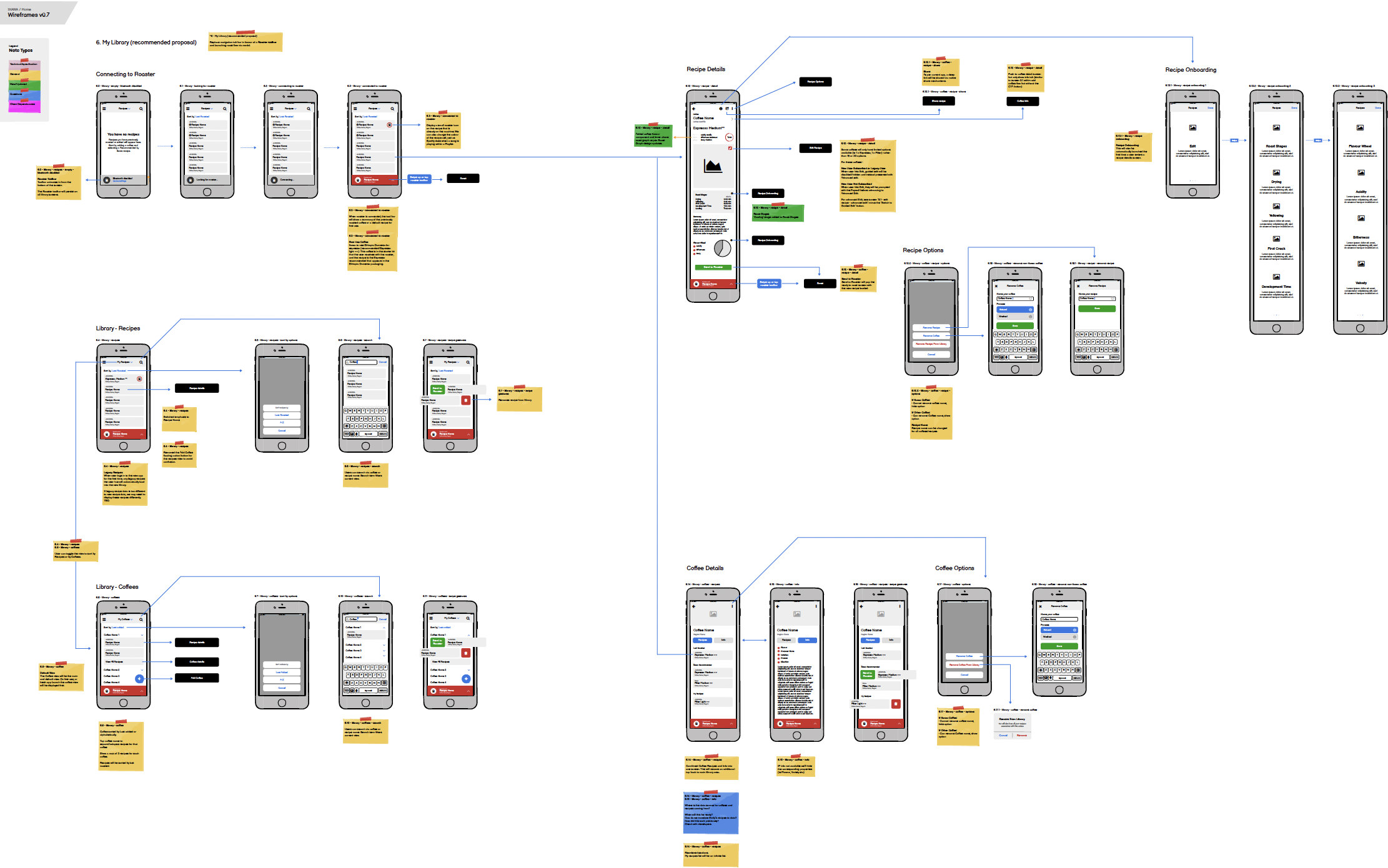
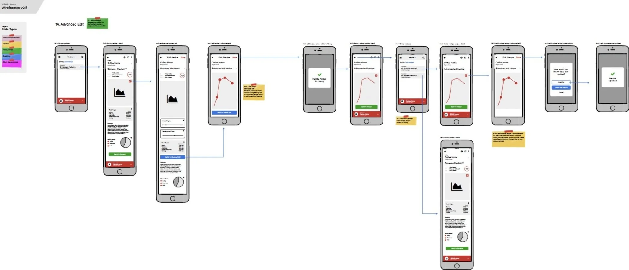
As soon as we had a clear idea of the features we were going to implement, we started to draft the user flows for each feature and how each screen would be connected with each other. Sketching them, was the easiest way for us to understand visually the functionality, by doing so, we started wireframing.
Flow: My library - Recommended recipes.
Flow: Advanced edit.
You can have a look at the flows for all sections of the new app here.
SOLUTIONFinal outcome - Highlights.
Each highlight captures an aspect of the new Ikawa Home app experience. It calls out which design goal it adheres to, what user scenario or problem its solving and what the solution is.
DESIGN GOAL: COHESIVEGuiding users through app features and functionality.
The new onboarding goes through a step by step guided flow through the features that the new app includes, so users are familiarised with the Ikawa platform quicker. This helps avoid a cold start when users land on the product for the first time.
DESIGN GOAL: COHESIVETailored coffee library
USER SCENARIOWhen roasting a recipe, users want to relate them to a specific coffee and be able to see which recipes they have roasted within the same coffee in a tidy way.
SOLUTIONThis way, the user will have a green coffee library fully bespoke to what they own, as if it was the shelf of their kitchen, displaying just the coffee they have available. They can click in the coffee to drop the recipes roasted within the same coffee, as well as finding out more information about the coffee they have added.
We also have incorporated the option of it being a recipe library, as it was previously and the user can switch between both and even filter them by alphabetical order or last roasted.
DESIGN GOAL: FLEXIBLEEasily adding your coffee
USER SCENARIOThe user had one method to register a recipe: by scanning a QR code. They didn’t have any other option available to start roasting in case they didn’t want/ couldn’t use the camera to scan the code.
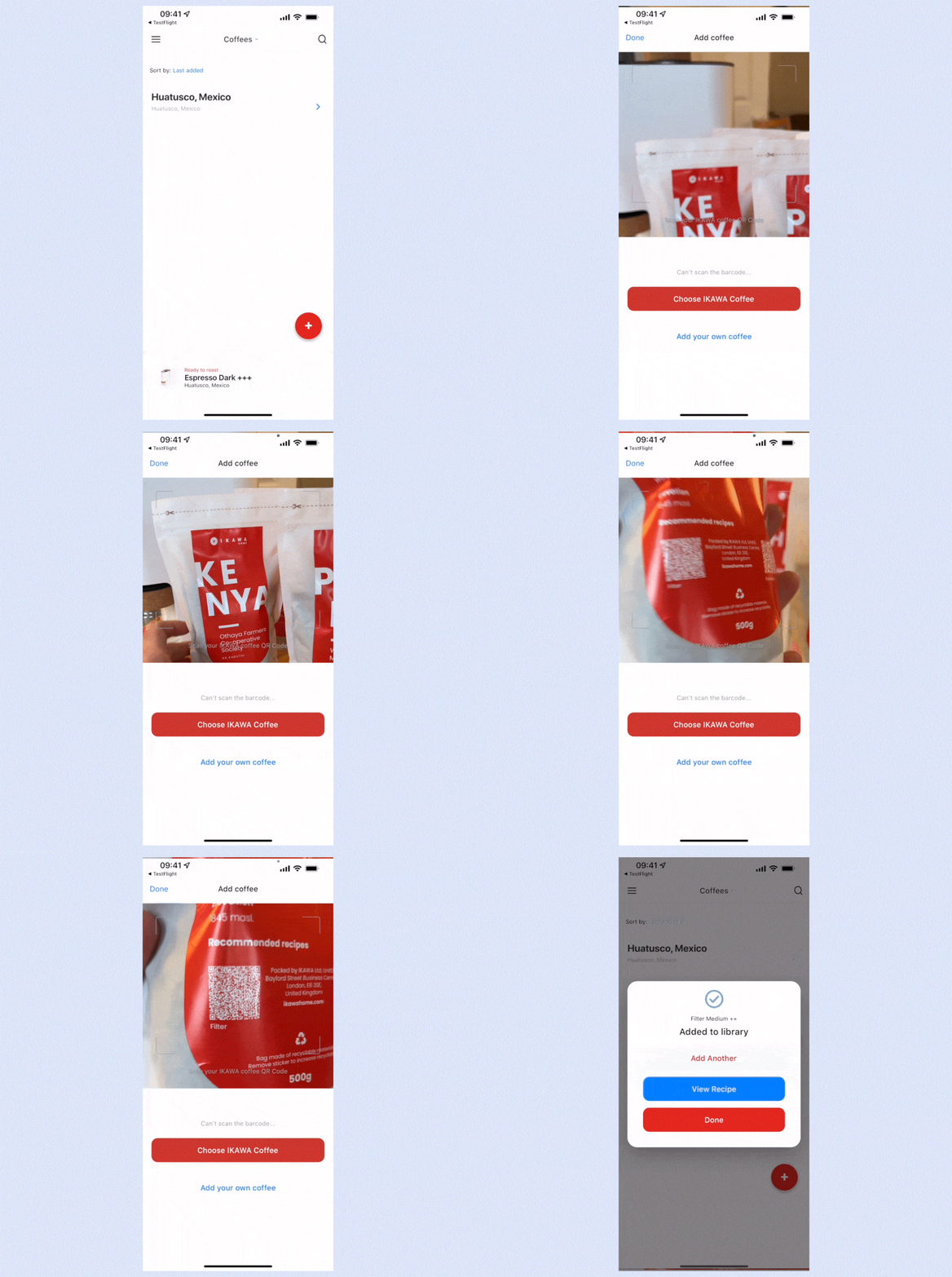
SOLUTIONNow users can choose the method of how they want to add coffee (instead of recipes), have access to the coffee producer’s information, and start building their customised coffee library. They now can add coffee by:
· Scanning the packaging QR code (if it’s an Ikawa coffee).
· Selecting an Ikawa coffee from a list.
· Adding any green coffee that they own from any other source.
This way, Ikawa instead of displaying random coffee roasting recipes, now is coffee driven - aligned to the company vision and being able to provide information about origin and coffee processes that our users were craving for.
DESIGN GOAL: COHESIVECoffee origin information
USER SCENARIOPreviously recipes were roasted generally without taking into account the coffee the user was roasting. This made no sense, as coffee is as important as the recipe when we want to get a specific roast.
SOLUTIONThe app is now coffee driven. Coffee is an ingredient with many varieties and characteristics that affect the result, so we need to be specific about the information. You’ll need to register/add the coffee first in order to select a recipe. Recipes are now tidied up within each coffee, being easily identified and organised by date.
Each coffee has a story behind that connects users with its producer making the coffee special. By adding a bespoke screen for the coffee information, we are educating the user by explaining the specific qualities it has and the story from its origin.
DESIGN GOAL: FLEXIBLERoast any coffee from any source
USER SCENARIOAfter all the interviews we have had and insights collected during time, our users were telling us that they didn’t want to feel committed just to Ikawa coffee when roasting. Most of our target personas are travellers and buy coffee from every part of the world, so they wanted to be able to roast any kind of coffee.
SOLUTIONWe have created a specific area in the app that allows adding any kind of green coffee and that would give the user a recommended recipe based on the coffee process, so they have a base recipe they can start from.
DESIGN GOAL: SIMPLESwipe & Roast
USER SCENARIOPioneers are time poor and very techy. They want something simple, easy and quick to start roasting.
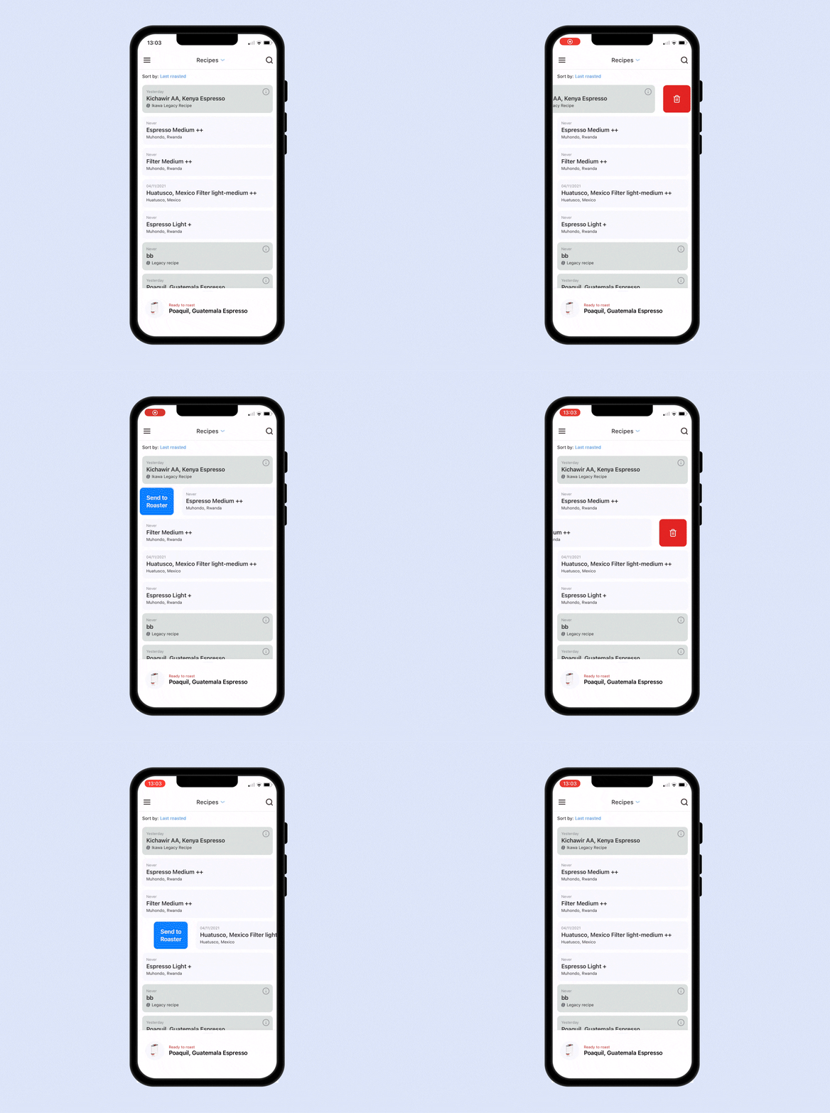
SOLUTIONThere are a few app journeys of sending a recipe to the roaster, but we have also incorporated the swipe gesture to make roasting easier than ever for Pioneers.
DESIGN GOAL: SIMPLEGuide users when editing their recipes
USER SCENARIOIn the previous app version, users were lost when editing their recipes as there wasn’t a reference for them to know the effect of what they were editing, resulting in losing control over the outcome.
SOLUTIONWe have created a mode for editing recipes called “Guided edit” in which by the parameters of Roast degree and Development time, the user is able to edit his recipes controlling the result, as they are pre-set recipes that have been created and tested by our experts, guaranteeing good roasting results.
Furthermore, some advantages of this mode are:
· The user can see how changing parameters modify the graph in real-time, understanding the effect that a parameter change causes.
· The user knows what to expect.
· We educate the user with coffee terminology, processes and content, becoming a reliable source for their journey in coffee roasting.
In addition, the user can always go back to the old mode of editing: “Graph editor”, which is protected by a paywall. Our idea is to differentiate ourselves from the Ikawa Pro app, which offers this feature because of the level of knowledge their users have, not being related to the Home user’s knowledge, which is more basic. This way, we make our target persona's life easier by presenting them with trusted solutions for roasting their coffee.
DESIGN GOAL: SIMPLEUser-friendly visuals and easy-to-digest content for a complex coffee world
USER SCENARIOOur users feel lost because there’s no central and reliable source of information for learning coffee roasting, so they end up looking across many sources, not knowing if they are reliable and feeling like a disjointed experience.
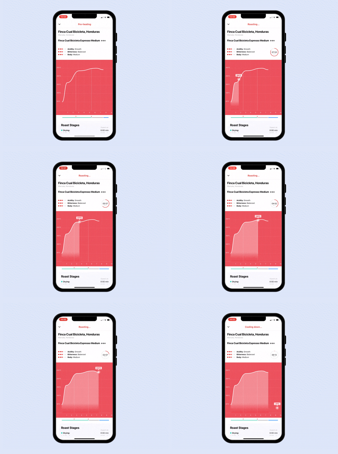
SOLUTIONWe are displaying the roasting screen in an approachable way for our users to understand the complex roasting process and its information. By improving the UI and making the content more visual, we are making it more understandable and digestible to learn.
DESIGN GOAL: SIMPLEStatus bar
USER SCENARIOPreviously Ikawa had a bottom menu from which you needed to swap icons to get the information you needed, not being able to do two things at the same time.
SOLUTIONA new item has been incorporated in order to inform of the status of the roaster or the next steps to follow. This way, the bar acts as a tool for the user to control what’s going on in the roaster, as the same time he navigates through the app.
IMPACTBefore the launch 60% of our users stopped using the roaster after 3 months of usage because they didn’t know how to get the roasting results they wanted. The Ikawa Home app increased engagement by 35% just in the following two months since its launch in December 2021. The new app has helped stop the usage drop keeping users engaged, and increasing roasting activity for those who stopped using it. The new Ikawa Home app has encouraged thousands of coffee enthusiasts to reach their goals of learning the craft of coffee roasting easily and have access to reliable information coming from a trustworthy source - Ikawa, making the experience easy and reliable.
It has also increased sales of green coffee by 56% by presenting the origin information and characteristics of each producer that Ikawa works with, and by being transparent about the supply chain thus, adding value to the selling process.
NEXT STEPSBecause of the deadline we had, we needed to prioritise tasks for the new app launch, as there were many things we would have liked to implement and we couldn’t because of time or resources:
One of the features we would like to implement in the next round is the built-in shop. At the moment the shop links to the website and it is something we would like to be adding in the next launch.
We couldn’t focus entirely on providing all the content we would have liked to for all our coffees. The next thing would be trying to translate all the new content in each “coffee information” screen in an easier and more visual way for our users to keep learning and understand it clearly.
I would have liked to be able to develop a more in-depth Design system to work faster and collaborate on building the screens with more people. The UI was something we didn’t have the time to focus on to create innovative and eye-catchy designs, and that’s something I would like to focus on in the next round as a challenge.
In parallel, we have been working on a new feature that would allow users to record their notes when roasting as well as when they do a coffee tasting - “The coffee journal”. This is a feature that almost every user we have interviewed has asked for, and it’s almost there. We can’t wait to test it!


